Role Pro bono UX/UI Designer
Duration 1 week
Responsibilities Conduct user research, redesign logo, redesign web layout, establish brand colors, visual design, wireframing
Developer Jane Yu
It started with a Facebook post
One day, I saw Jane Yu's post on the Bay Area Vaccine Hunters group on Facebook.
I was so moved and energized by her cause that I reached out to her to offer my UX design skills. Jane agreed, and we started working together on making her site better address user needs.
Vaccine Hunter Laments = User Research
In a group of 28K desperate vaccine hunters, this is a natural forum for people to vent about their frustrations with securing vaccines and confusing county and state regulations. After reading a few posts detailing strategies for securing appointments and the comments section, here are the frustrations that users encounter during the vaccine appointing booking process:
People need a better way to book vaccination appointments because visiting multiple sites with no appointment availability guarantee is time consuming and often disappointing.
Current Product
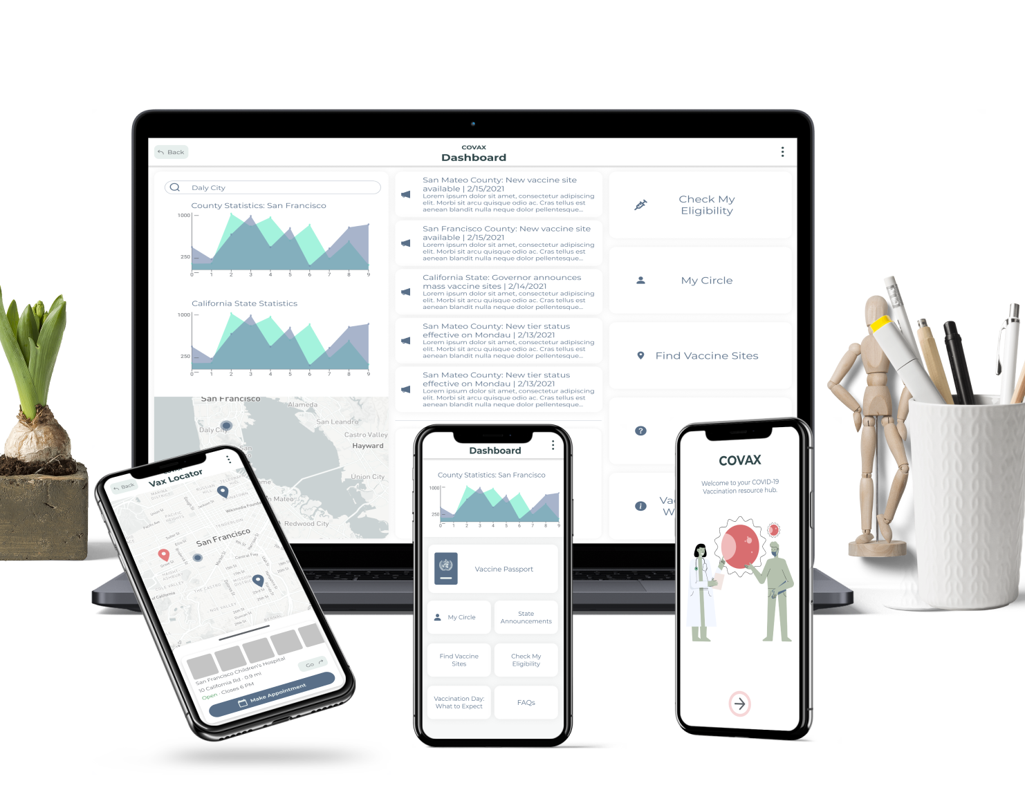
Jane developed an incredible service that addressed user needs. Her product pulled vaccine appointment availabilities from major pharmacies like Walgreens, Costco, Rite Aid, etc. to a centralized location (VaxBay.com). Each availability listing comes with a link that leads directly to the start of the vaccine site's booking page in a new tab.
The site is straightforward and functional. However, as the amount of appointments increase as we approach the statewide eligibility date of April 15, there is no way to filter the listings.
The center aligned text is hard to read, and the instructions are buried in the intro block of text.
User flow to obtain a vaccine appointment through conventional channels:
User flow to obtain a vaccine appointment via VaxBay:
Usability Optimization
For most vaccine appointment sites, users have to input an address or zip code to populate vaccine sites then check for vaccine availabilities.
To streamline that process, we added copy shortcuts for the zip code and the address. This way, users don't have to mouse over the address, highlight the text, and hit Ctrl-C. Since vaccine appointments come and go in a matter of seconds, it is important to minimize the time that the users spend preparing information to input into the appointment sites.
We added checkbox filters for users to filter the vaccine availability listings by county.
Technical & Time Constraints
Due to job and education commitments that both Jane and I have, VaxBay at present does not represent our vision.
Ideally, we would like to include filters by county, zip code, location, date, and vaccination site.
We wanted to get the site up and running by April 15th to help with the mad dash hunger-games style hunt for vaccine appointments when California opens up vaccine eligibility to everyone 16+.
VaxBay.com is now LIVE! If you live in the Bay Area, check it out and help yourself and others get a vaccine appointment!
