Role Designer, Researcher
Duration 2 weeks
Responsibilities Business research and owner interview, user interviews, survey crafting, data synthesis, wireframing, visual design, prototyping, user testing


A Strong Brand Presence
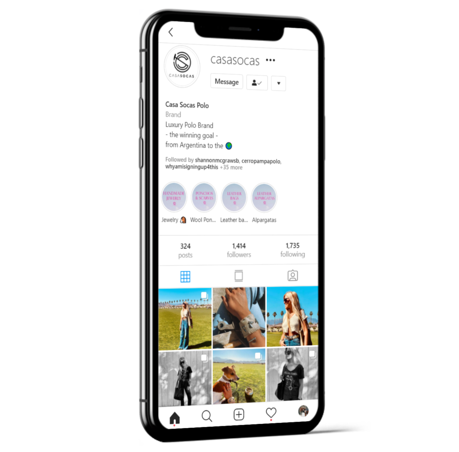
Casasocas is no stranger to social media. Their Instagram account is filled with professional photos that show off their products and convey a carefree way of life filled with horses and blue skies.
But where do customers go to buy their products? There are no instructions in the Instagram bio, and there is not website link. To the customer, that is too much work, and there is no guarantee if they would even get a response.
In this project, I conducted user research on Casasocas customers and created a mid-fidelity prototype of an e-commerce store for Casasocas.
Polo: A Way of Life
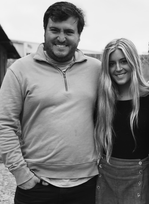
Polo is a way of life for Juana and Toto Socas. Growing up in a polo dynasty where their father and uncle are prolific polo players, polo is not just a lifestyle.
Juana and Toto sensed an opportunity in the niche market of polo and equestrian sports in the US, Juana and Toto created Casasocas in 2019. They revived old partnerships with Argentine makers to bring handcrafted goods to the US market.
Casasocas proved to be a success upon the first launch. They set up booths at polo tournaments and used amateur polo players as models, making the brand authentic, luxurious, yet attainable. Their Instagram page is full of beautiful photos that encapsulate the polo lifestyle. Most of their customers are polo players, wives of polo players, and polo spectators who shopped at the Casasocas booth during polo games.
Like many other businesses, Casasocas experienced a significant slowdown when pandemic lockdowns hit in March 2020. However, not having polo events to set up a booth decreased their revenue significantly. Currently, they rely on the Casasocas Instagram page and word of mouth for business.
A Unique Space in Luxury
Based on the style and products at Casasoca, I curated a list of 3 business that I deem to be their direct competitors and conducted competitive analyses on them. Stick & Ball Co. stood out to me as their strongest direct competitor because they also spotlight the polo lifestyle and working with small vendors. The other businesses are Pampeano and Atelier CG.
Juana and Toto both indicated that Stick & Ball Co. is their biggest competitor, which was consistent with my analysis below:

Stick & Ball Co. is a California polo lifestyle brand based out of Petaluma, California. They focus on sustainable practices and supporting small local vendors that use high quality materials to create products at S&B. Their signature product line is their poncho collection. Like Casasocas, S&B has hired actual polo players to model their products. They carry clothing items for women, men, kids, as well as decorative home items. Their Argentine-inspired style carries a Californian twist which are evident in their scarf, belt, and accessory collections. They have an extensive leather goods collection, but leather products comparable to Casasocas' collection start at a much higher price.

Pampeano is a UK-based polo lifestyle brand with an emphasis on leather goods. They offer leather collars for horses and pets, bags, belts, and accessories that are embroidered with their signature Argentine-inspired diamond pattern with a Western color palette. While they offer similar products, because they are based in the UK and shipping is rather expensive, they are not well known in the States.
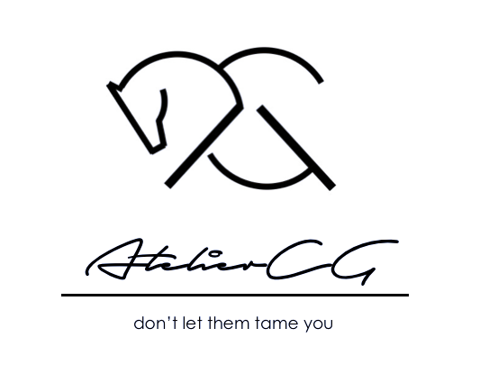
Atelier CG is an equestrian themed lifestyle boutique based in n Los Angeles. They sell leather bags, small leather goods, and equestrian-inspired jewelry with an edgier style. They collaborate with local artisans to bring their luxury products to the fashionable equestrians. Atelier CG is more popular and known amongst the hunter-jumper circles as they set up booths at horse shows and partner with influencers in the hunter-jumper community.

Casasocas is an up and coming polo lifestyle brand with a niche following and social media presence. They need a better way to sell their products because the live events that brought in the most revenue are unattainable due to the pandemic.
How do Casasocas' customers shop?
I conducted 2 interviews over Zoom and obtained 16 survey results. Since Casasocas is geared towards the female equestrian market, all interview and survey participants were females ranging from 18-50 years of age who are involved in the equestrian world. All the participants are comfortable with purchasing goods online and indicate that they do so on a regular basis. Based on the interviews and surveys, the following themes about user preferences, challenges, and behaviors in regards to online shopping emerged.
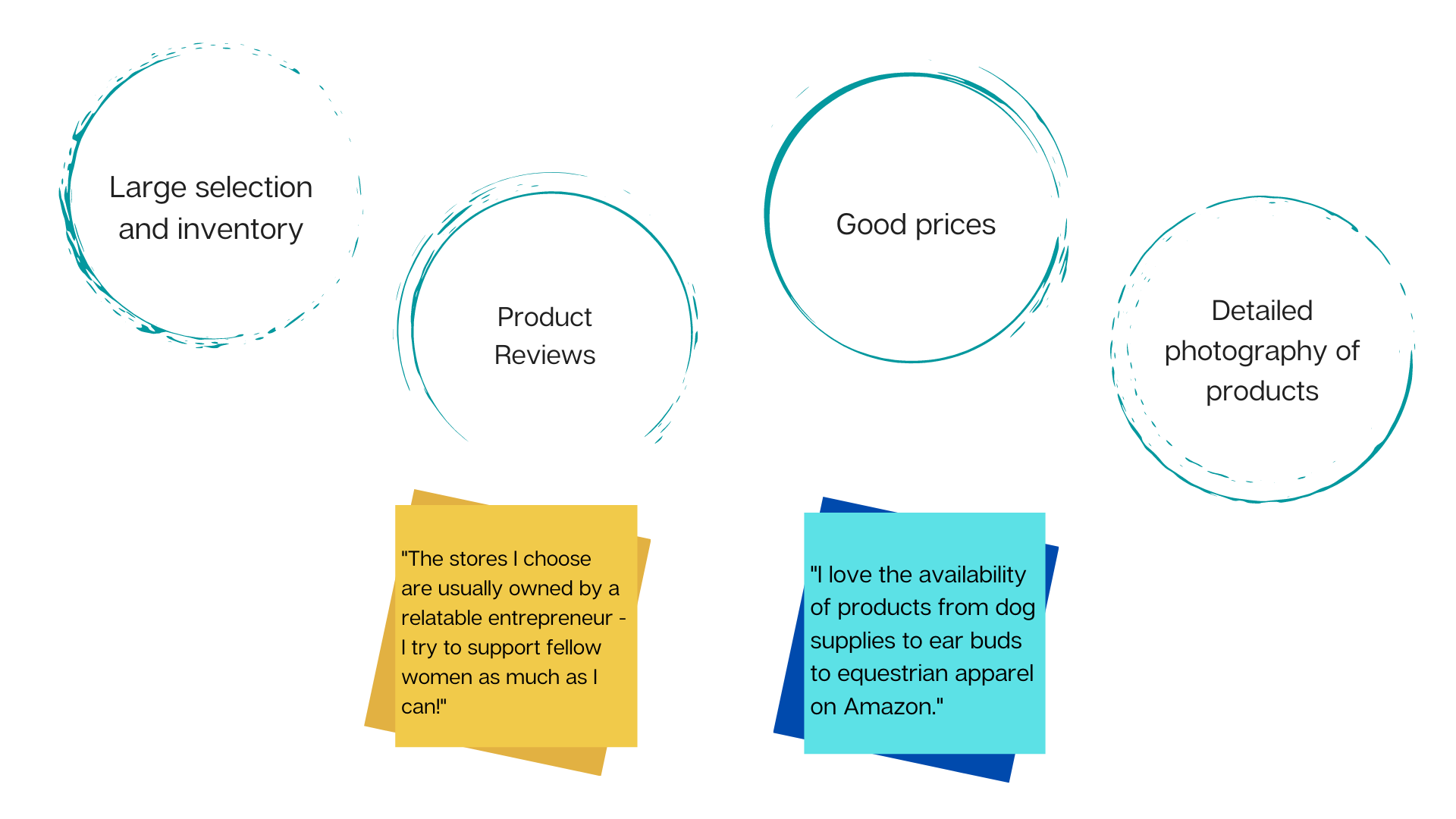
Users look for the following for optimal e-commerce experiences:
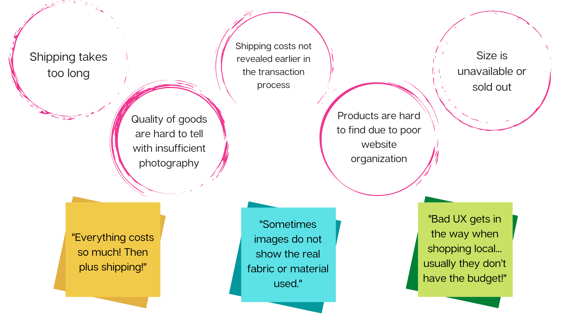
Users report that these experiences make for a sub-optimal e-commerce visit:
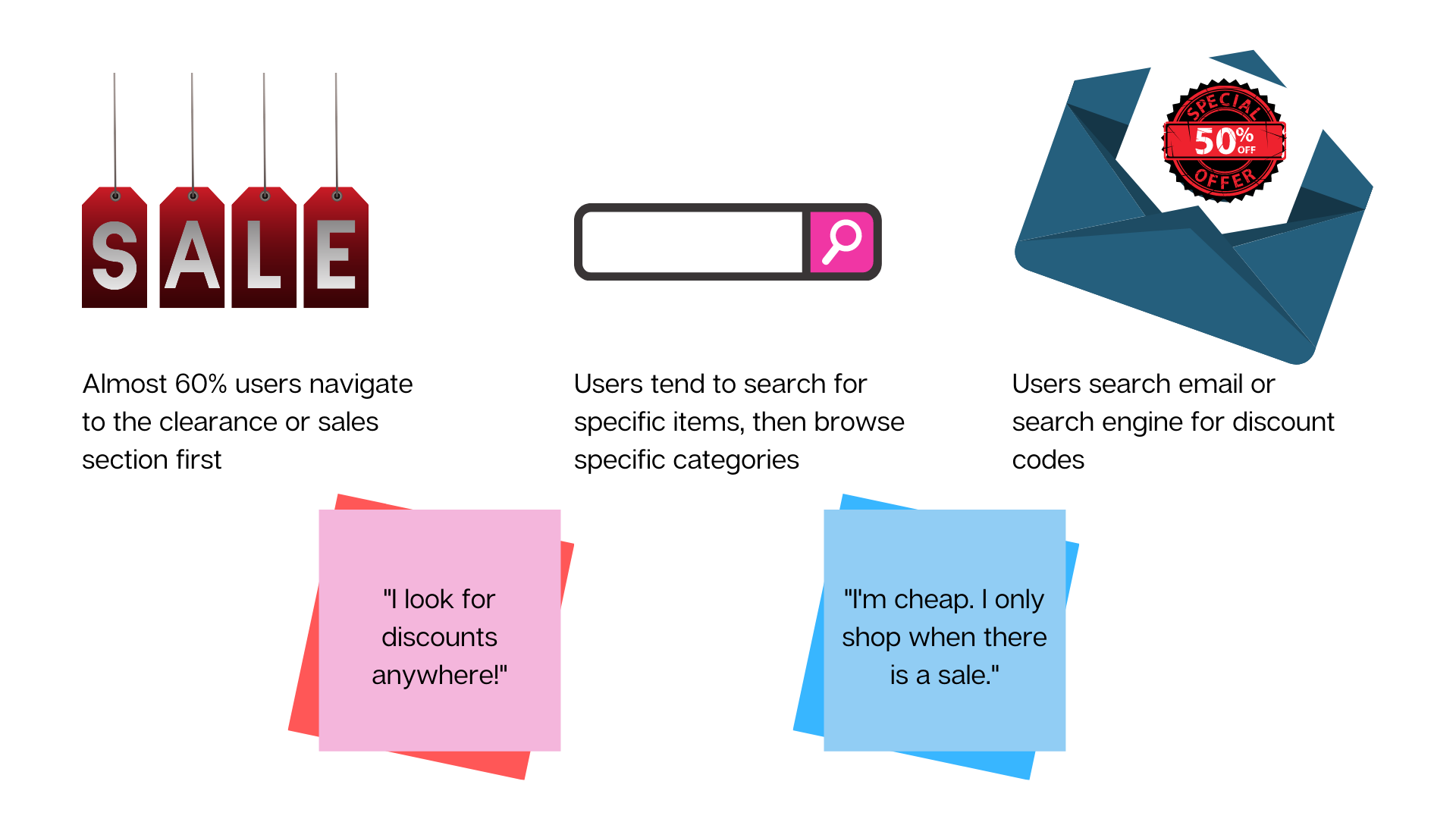
Users have set behaviors when it comes to interacting with e-commerce sites:
User Personas
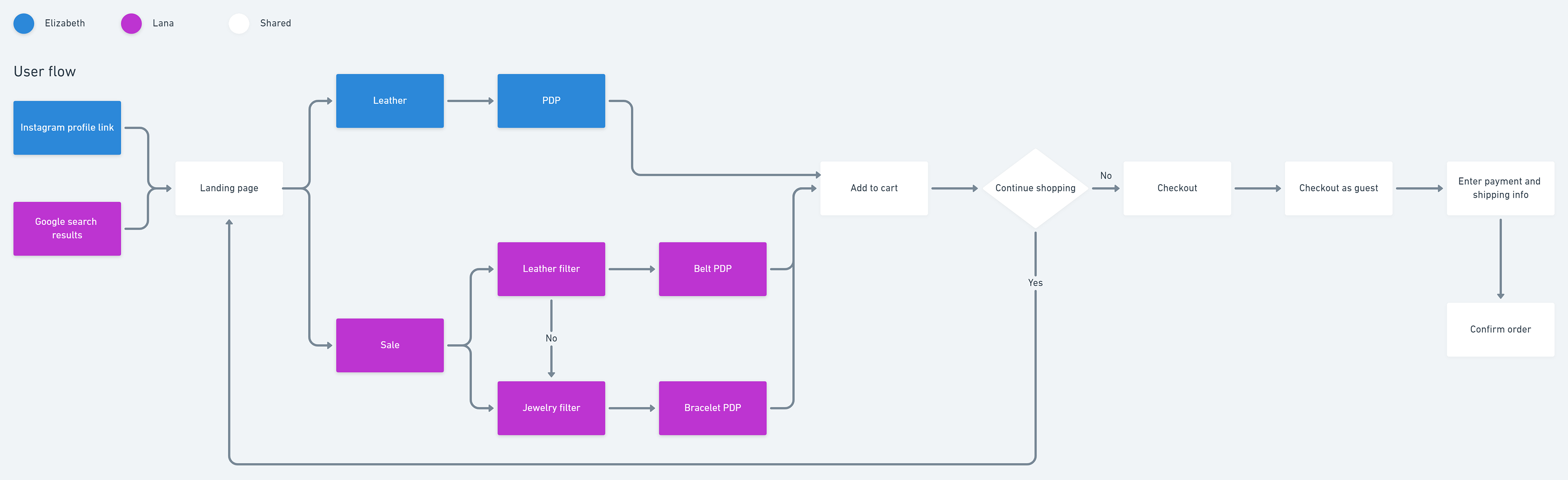
Based on user interviews, interviewing the business owners, and survey results, I crafted two user personas: the Lifestyle Spender (Elizabeth) and the Sale Shopper (Lana).

Elizabeth | Real Estate Broker | Orange, CA | 34
Elizabeth needs a better way to know about the quality of the product she is interested in buying from a website because she does not want to buy a product that doesn't meet her standards.
After seeing her friends Lisa and Mindy carry Casasocas leather bags to polo practice one weekend, she knew she had to have one. She found the Casasocas Instagram page and followed the link in their bio to the website. At the landing page, she goes straight to the leather section, finds the bag that Lisa and Mindy were carrying, and checks out with the bag.

Lana | 2nd year law student | Santa Barbara, CA | 25
Lana needs a better way to know about shipping fees when shopping online because she does not want to go through filling out all her payment and shipping information only to find out that shipping is too expensive.
Lana is a 2nd year law student and avid show jumper who likes to hang out with the polo crowd. After seeing her friend post a professional-looking photo from a photo shoot with Casasocas products, she Googles the brand to check them out. Lana is a sale shopper and has a coupon code from Instagram for Casasocas. She goes to the sale section and picks out a fur belt with an oval buckle. When checking out for the item, she realizes that her mother's birthday is a week away, so she navigates back to the sale section to find her mother a jewelry item. She settles on a double mallet cuff and checks out with 2 items.

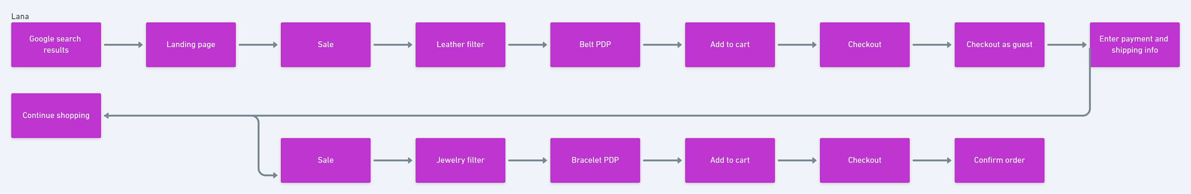
User Flow
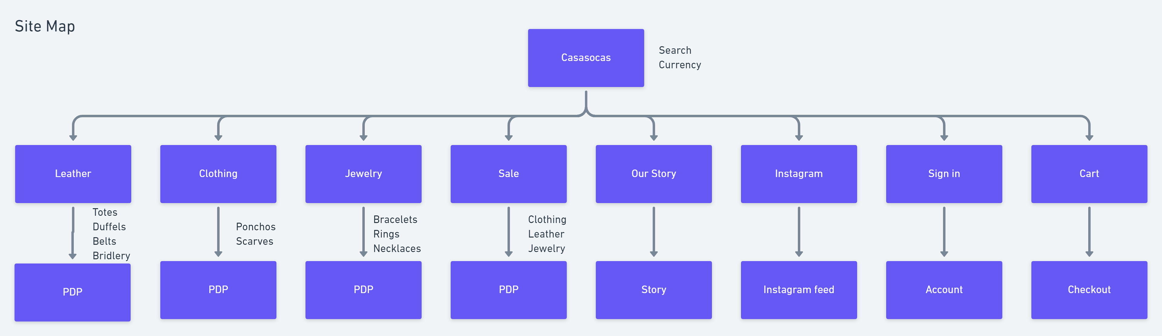
Information Architecture
Layout Design
In this project, my main focus was information layout, navigation, and addressing user needs.
Landing page
Users browse e-commerce sites in the following sequence:
1. Sale
2. New Arrivals
3. specific categories.
The top navigation bar has clearly laid out product categories and is one of the first things that users see when they visit the website.
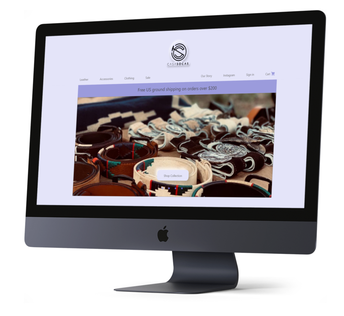
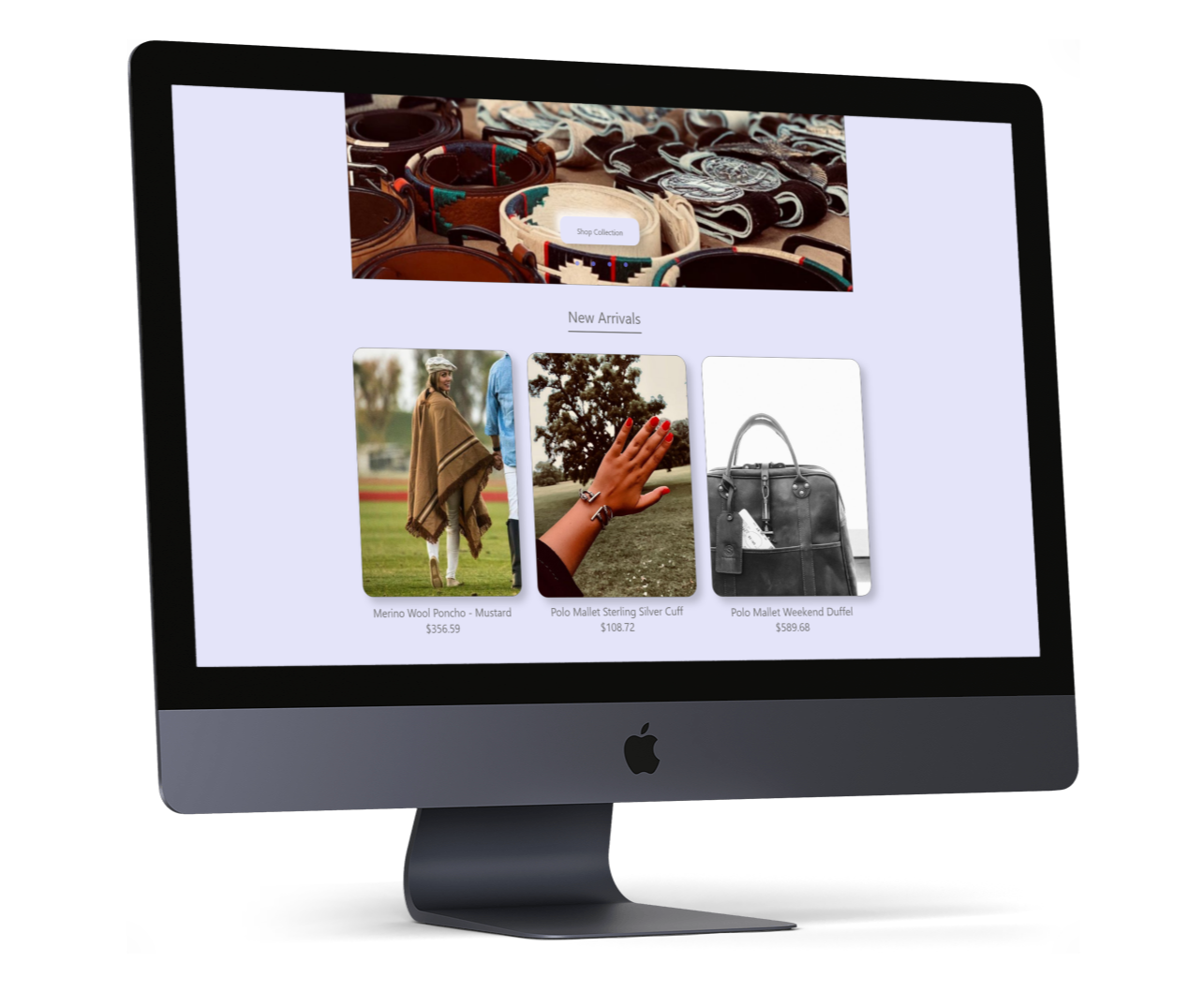
New arrivals are things that get both the users and the vendor excited. I put large tiles underneath the "Shop Collection" jumbotron to continue the visual storytelling of Casasocas' beautiful products.
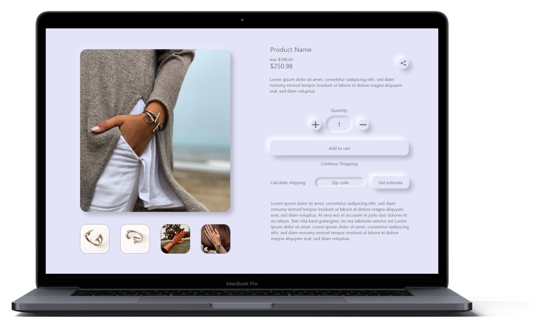
Product Page
Users want to know the shipping cost upfront because they have had adverse experiences with being hit with a substantial shipping fee at checkout.
Apart from the free shipping banner that is visible in the header, users can input their zip code to get a shipping cost estimate and not be surprised by a shipping fee during checkout.
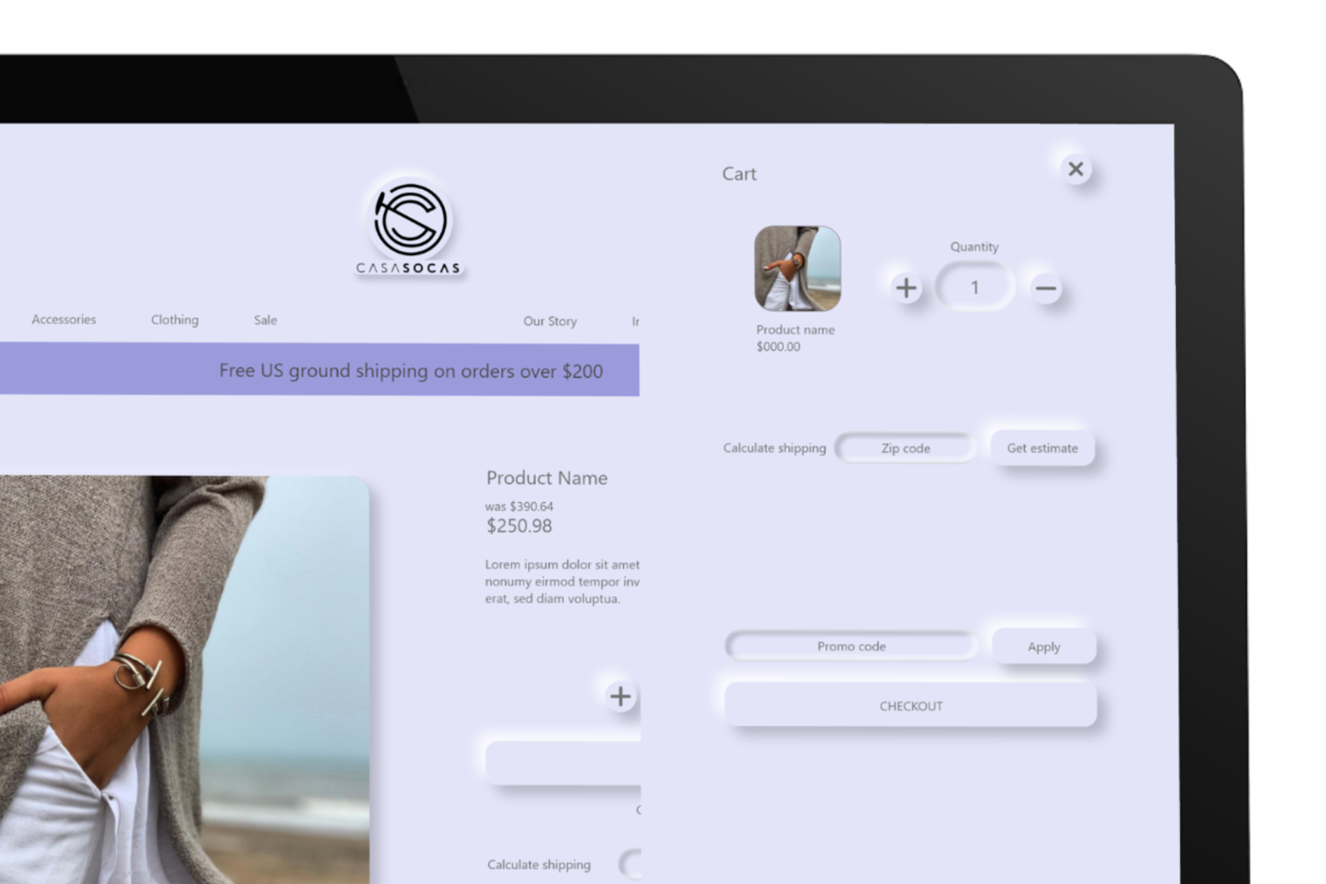
Cart
Users are able to see their cart without leaving the product page. This way, if they see a recommended item at the bottom of the page, they are able to easily navigate to the item. In the cart sidebar, users can once again get a shipping cost estimate as well as apply any promo codes they may have and see the total amount after the applied discount.
Prototype
Usability Testing
I conducted 3 usability tests on the prototype with some technical adjustments in between each test. All 3 participants successfully both task flows, but indicated some confusion and hesitancy in 3 areas as indicated by the numbered orange spots below:
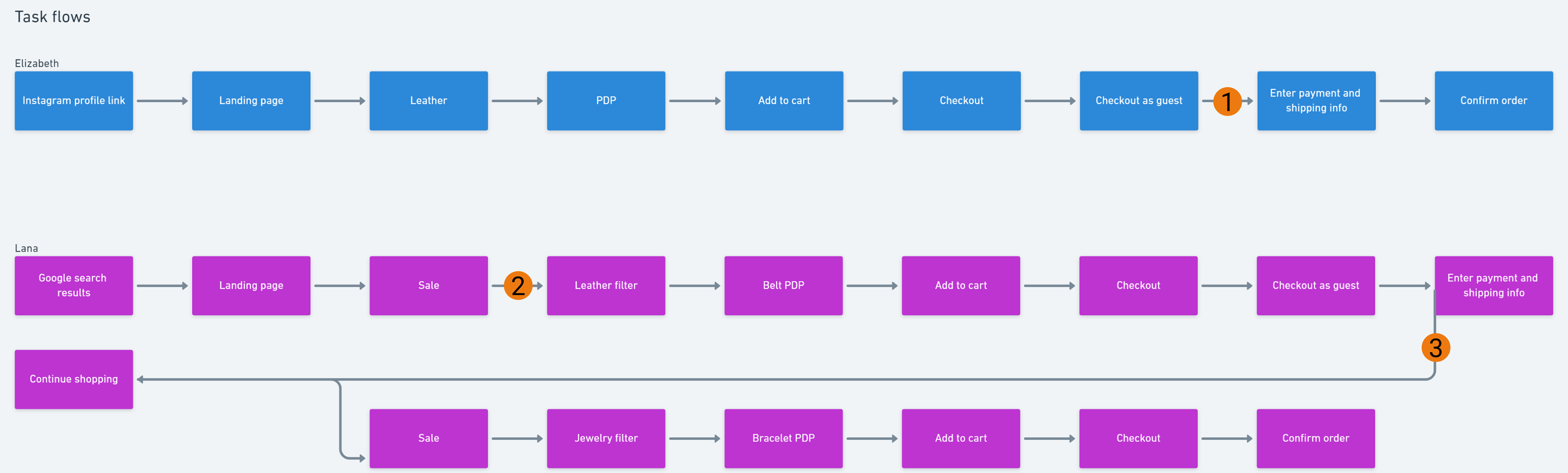
1. Checkout page: Users indicated that the skeuomorphic credit card looked cool, but was a little confusing. The visual of the card made users think that their payment information was already filled out. So, they scroll to the bottom of the form to try to checkout. When the checkout button doesn't work, they realize that the payment information form below the card is blank, so they scroll back up to fill in the form.
2. Item search in Sale page: users expected the item to be one of the immediately visible products listed on the page. I had to provide guidance to all 3 users before they found the filter function and filtered by category. As soon as they pressed the filter button, the task flow resumed as expected. Predictably, users knew where to go when asked to find another item in another category in the sale page.
3. Due to the odd nature of the task flow, users were confused by what was being asked of them. They all had to ask clarifying questions about the task. After clarification, however, users were able to complete the task flow without issue.
Usability suggestions:
One user indicated that the placement of the exit button was confusing because she thought she would exit the page instead of the "add to cart" overlay. She suggested that I lower the exit button to avoid that confusion.
One user found inconsistencies in the call to action button color. On the checkout page, the checkout button was differentiated by color and was the obvious button to press. However on the product pages and "add to cart" overlays, the call to action buttons are the same color as the quantity buttons and share buttons. She suggested that I extend the color differentiation to all CTA buttons.
One user expected there to be a search bar specific to the sale page when he couldn't find the item I instructed him to look for.