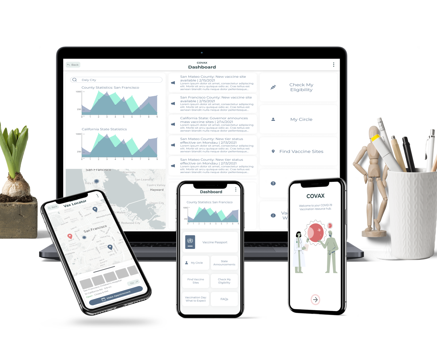
Company PickTrace
Role Designer, Researcher
Duration 2 week research sprint | 3 week design process
Status Released
Responsibilities Conduct user research with clients | Design solution | Obtain user validation | Track success metrics

Context: What is PickTrace?

PickTrace operates in the agriculture space.
Think about the apples, cherries, peaches that you see at your chain supermarket or Costco:
The people who picked that fruit have probably interacted with PickTrace.
PickTrace aims to accurately track labour and productivity out in the fruit and veggie fields and create timecards to make sure workers get paid fairly for their work.
PickTrace operates across 3 platforms and is connected by the cloud
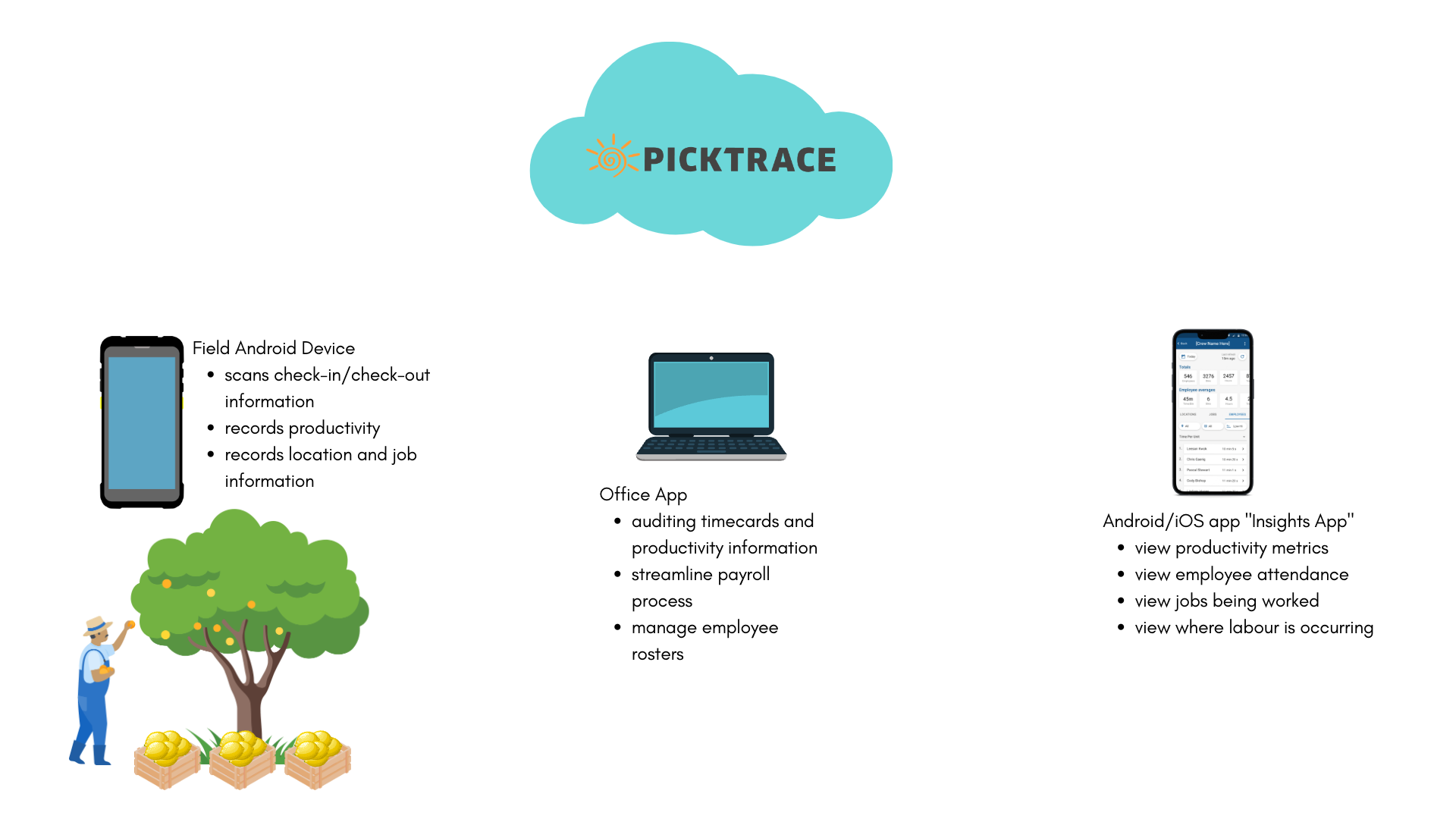
What is the Insights App?
The Insights App is a companion app to the Office and Android apps that's available on the App Store or Google Play Store.
The Insights App provides real time aggregate data from the field devices for those who do not have access to neither the field devices nor the office app.
The concept of the Insights App came from an abundant desire for owners, executives, and higher level decision makers to monitor labor activity on their farm without accessing the web platform.
The Problem: Low User Engagement
The Insights app sets PickTrace apart from their competition because no other agriculture time and productivity software come with an easily accessible companion app that provides real-time data.
Customers generally viewed the Insights App as a valuable tool, so why aren't they using the app?
My task was to find out what value customers derive from the Insights App in its current state, what day-to-day decisions they make, and how to use the Insights App to add value to their workflow.

Research + Findings
We visited customers in two states and interviewed 5 users from our biggest clients in-person and over Zoom
Questions
How do users currently use the Insights app?
What kinds of decisions do users make day-to-day?
Why do they have to make those decisions?
How are they obtaining the data needed to drive those decisions?
What decisions do they want to be able to make?
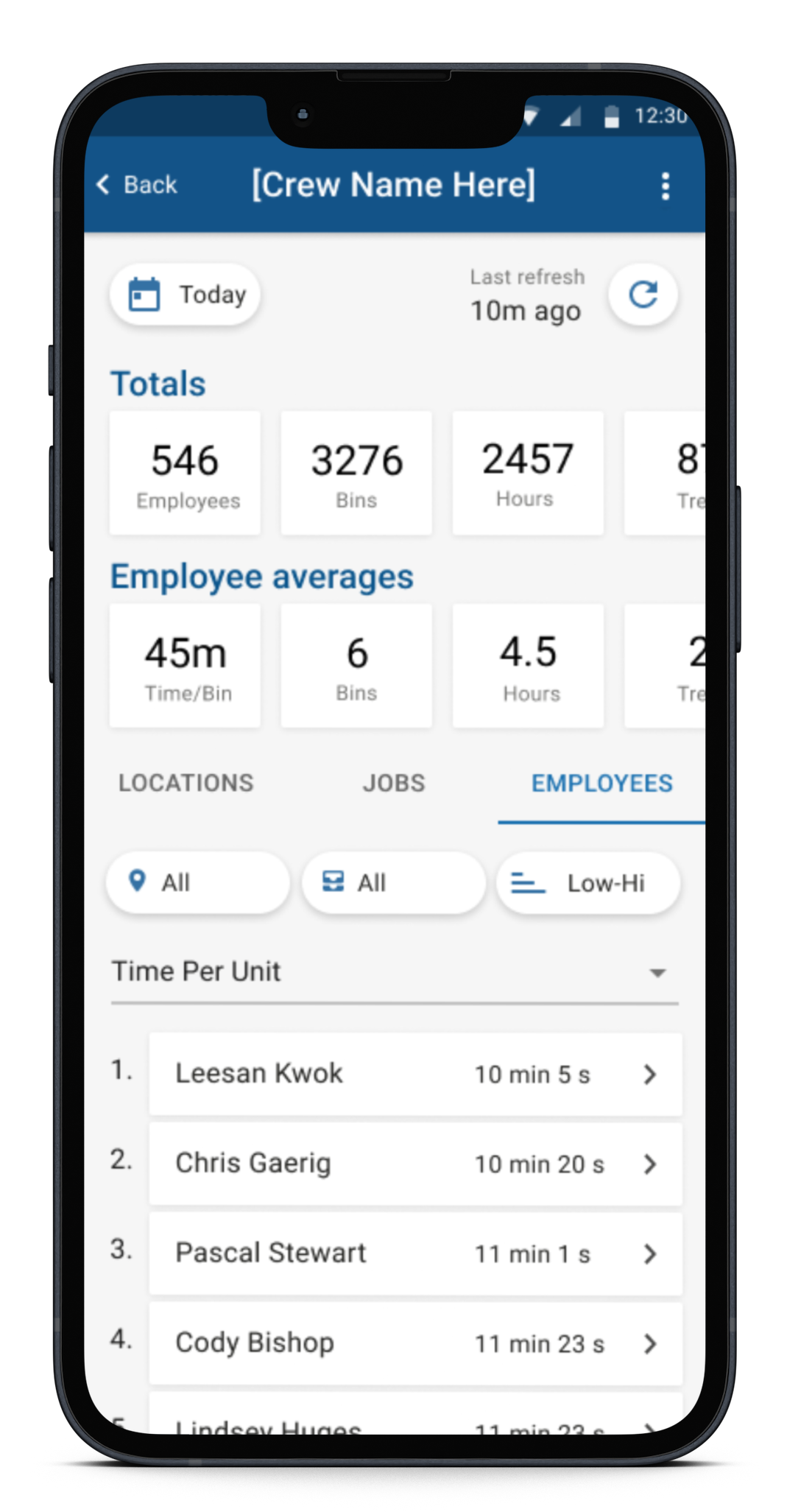
Finding #1: Data wasn't usable
While the Insights App provides real-time data that is valuable to decision making, the raw data simply enables users to calculate certain metrics that are required to make decisions. Our users are constantly doing math in their head.
What are they calculating?
Average cost per unit
Average piecerate wage per hour
Total time spent on a job
Minimum wage adjustment
Start time
Time per unit
Total labour cost
Total pieces
Units per hour
Insights App before the redesign
Finding #2: Lack of Context
Users require contextual information to make decisions
Eg. Employee average of Time per Bin metric
The current metric doesn't answer the following questions such as
- What is the speed of the fastest worker?
- What is the speed of the slowest worker?
- What is the median speed of work?
- What job does the average speed pertain to?
Without contextual information, some users call the field supervisor to identify the most average worker on the field and try to provide a guesstimated average work pace
With more contextual information, users would able to predict based on the average pace of work
- Which crews require extra bins to hold more fruit
- Where and when tractor drivers need to go to pick up fruit
- Which warehouse to send the fruit based on the warehouses' workloads for the day
Finding #3: Language Barriers
Due to language barriers, users find communication with field supervisors challenging
- Most executives and decision makers do not speak Spanish and cannot communicate effectively with field operations who are mostly Spanish speaking migrant workers
- Users wish to have direct access to data coming from the field without leaving their office
- Data such as the check-in roster help administrators ensure compliance in the field
Constraints and Challenges
1. Limited development resources
There was only 1 Android engineer on the project who was juggling other responsibilities.
2. No design system specific to the Insights App
There is limited documentation on this app as it was designed and developed by an engineer.
3. Highly involved stakeholders
Due to the high profile nature of the users of the Insights App (C suite executives, directors, etc.), we had to be mindful about setting expectations and be careful about sharing conceptual designs.
4. Users' technical abilities
Our users had varying levels of technical aptitude. We had to be mindful about changing the way the app works drastically to limit user frustration.
5. Pressure from the sales team to commit to a release date
The sales team want the improved Insights App to be ready for customers on trial and to show prospective customers.
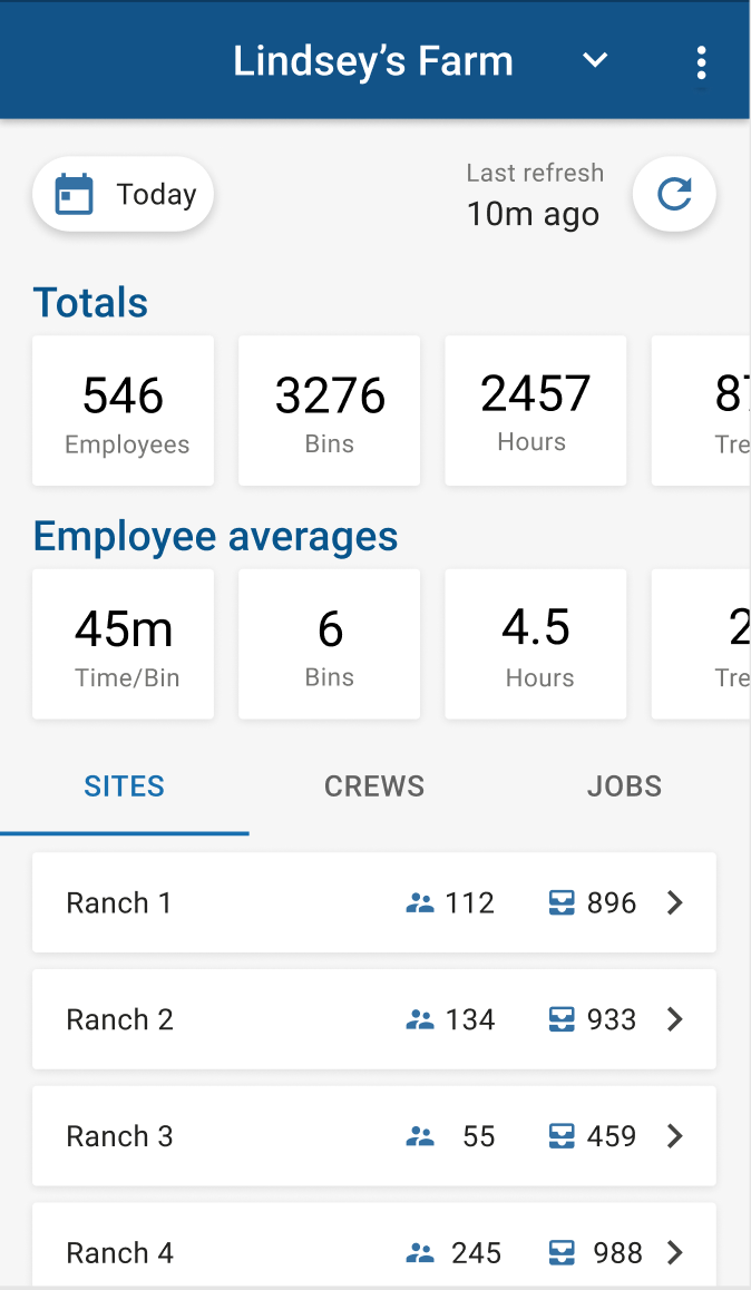
Solution
We wanted to maintain the layout of the home screen to minimize efforts for engineering. This also helps minimize the learning curve for our users, who are already accustomed to using the app. We settled on some usability changes to improve UX.
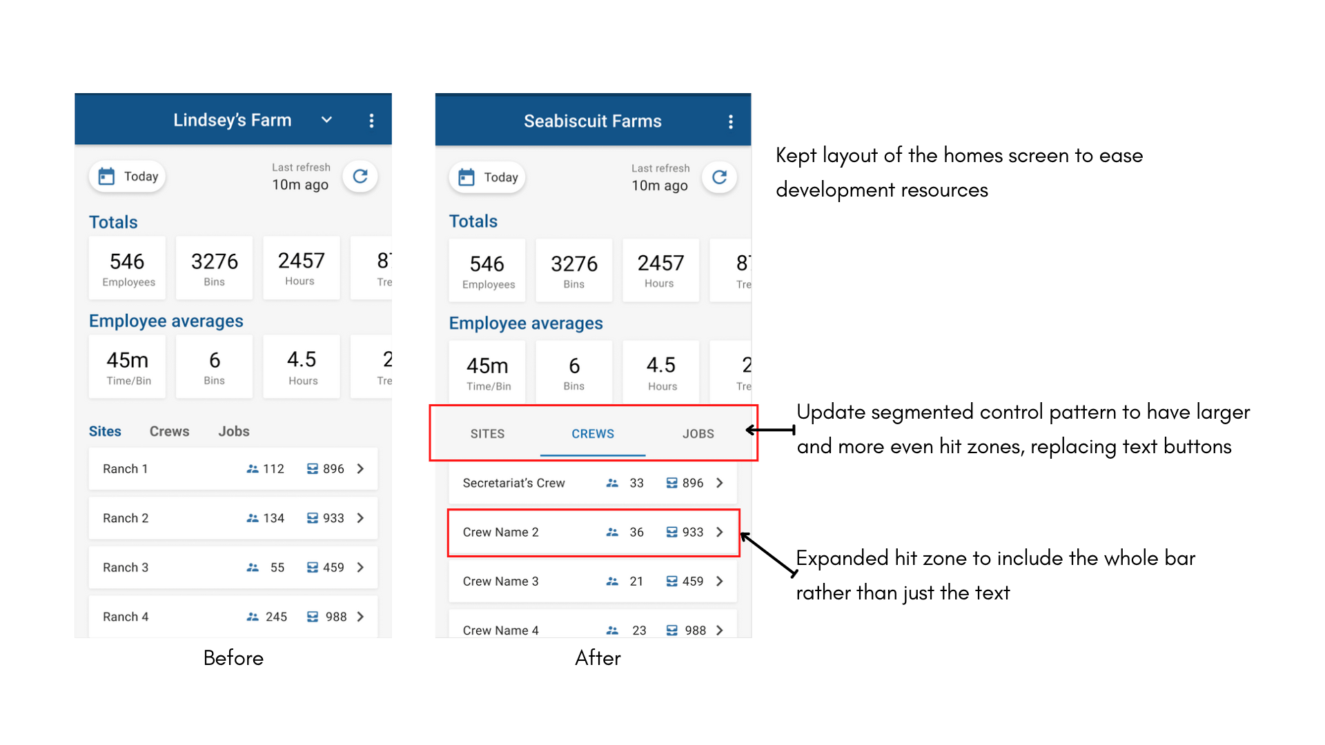
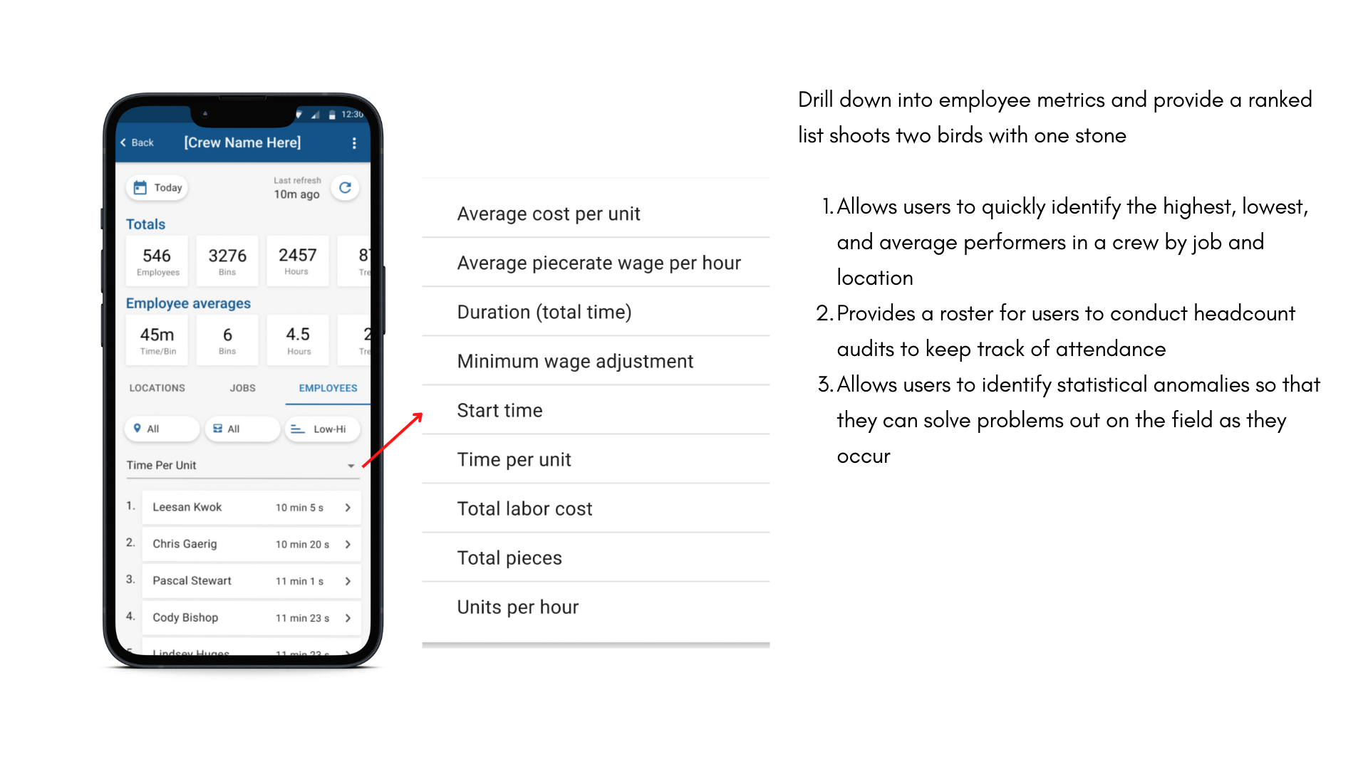
On the crews page, we wanted to surface information that is valuable to our users.
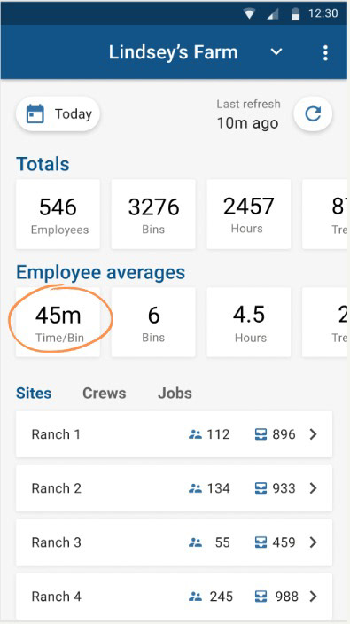
With the various metrics in a dropdown, we are providing users the context they were lacking. The lists that populate are ranked high to low or low to high, making it easy for users to identify high, low and average performers
With the various metrics in a dropdown, we are providing users the context they were lacking. The lists that populate are ranked high to low or low to high, making it easy for users to identify high, low and average performers
Because of the ranked list available, users can identify statistical anomalies and problem solve in real time instead of waiting for end-of-day or even end-of-week timecard reconciliation to try to figure out the anomalies
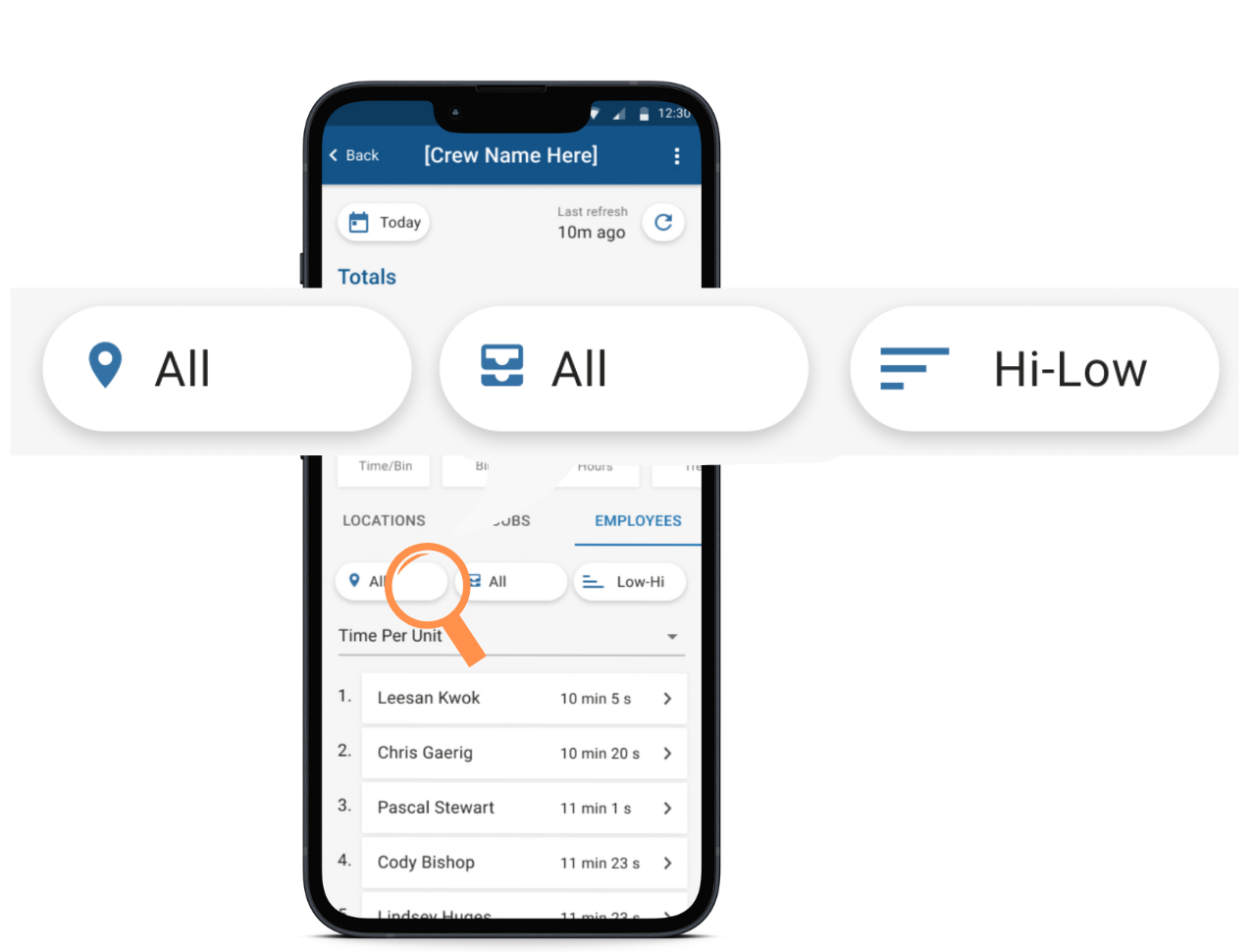
Filters help users gain context to the information that they are viewing. Users can see filter by location and job by ascending or descending order.
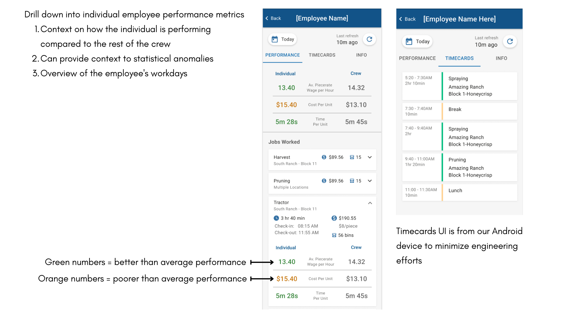
Drilling down further into the individual employee, you will see performance metrics compared against the rest of the crew and detailed information about each job the individual has worked.
We also added a timecards overview tab so that users can get a chronological view of an employee's day.
Learnings
What we could have done better...
1. Prioritize crew-level performance metrics over individual employee-level metrics
The only way to access crew averages is by drilling down into an employee's performance metrics. Feels almost backwards to skip over the higher crew level view and go straight to the most granular atomic data point.
However, we received a lot of stakeholder pushback due to customer demand for employee metrics
2. Showed the Insights App to users beyond the executive level to uncover the full potential of the app
We have been getting requests from executives to give field and warehouse operations access to the app because they can reference the same info and trouble shoot together.
Warehouse operations can use metrics like units per hour to anticipate supply and redistribute labor within the warehouse to respond to the supply or communicate with other warehouses to distribute the workload and minimize overtime.
Warehouse operations can use metrics like units per hour to anticipate supply and redistribute labor within the warehouse to respond to the supply or communicate with other warehouses to distribute the workload and minimize overtime.
Success Metrics
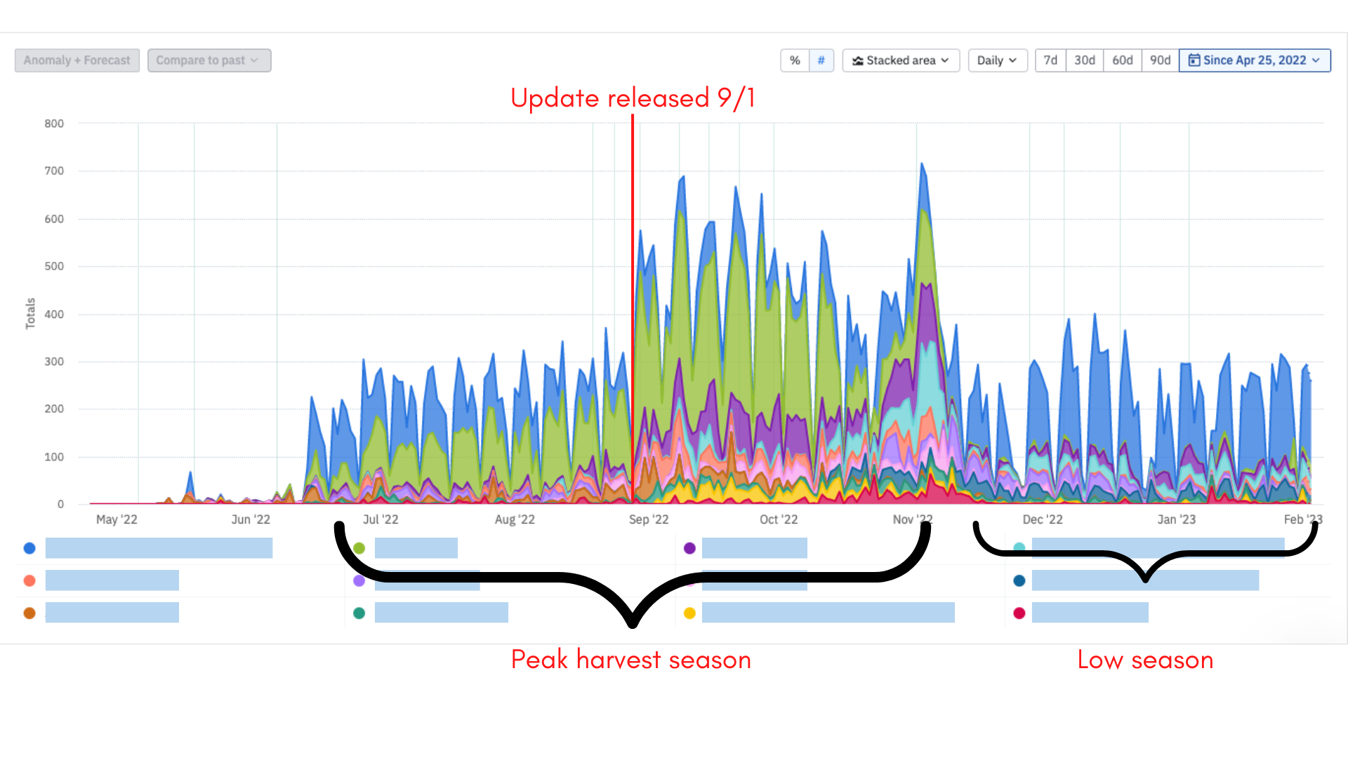
Leveraging data from Amplitude, we tracked how frequently users visited the home screen of the Insights App. Each color represents a different customer. Our customers are predominantly apple, cherry, and stone fruit growers, so their peak harvest season falls between June to November. Peak harvest season is when metrics like cost per unit and average pace come in handy for decision making.
The major update was released on September 1st. Partnering with Customer Operations, we sent out a release email highlighting enhancements to the Insights App. Soon after, we see a sharp uptick in app usage that was sustained through the end of harvest season.
Customer Testimonials
Hops (for brewing IPAs) grower
"I use [the Insights App] all the time. I refresh it at least 10 times a day."
Grapes grower on trial (update: they have ended their trial period and committed to PickTrace)
"This will be very useful. I think that alone will finalize our management approval [to go with PickTrace]!"
Stone Fruit grower
"My receiving guys [at the warehouse] use [the Insights App] to anticipate supply and cross-check bins coming in."